A menu, a sub-menu, a sub-sub-sub menu…
I hate that. Don’t you ?
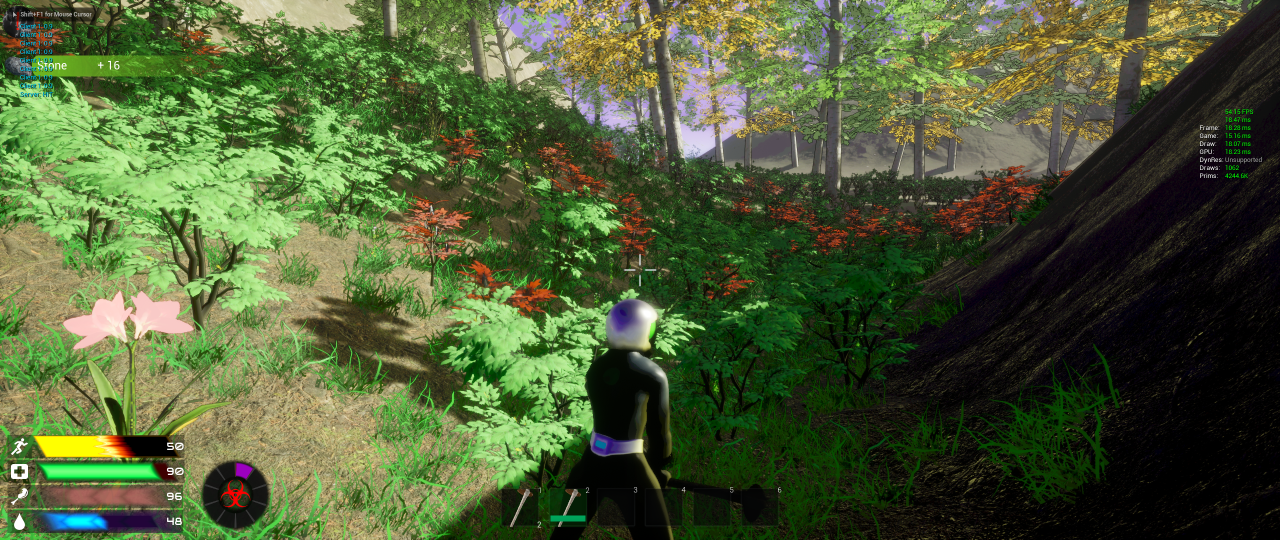
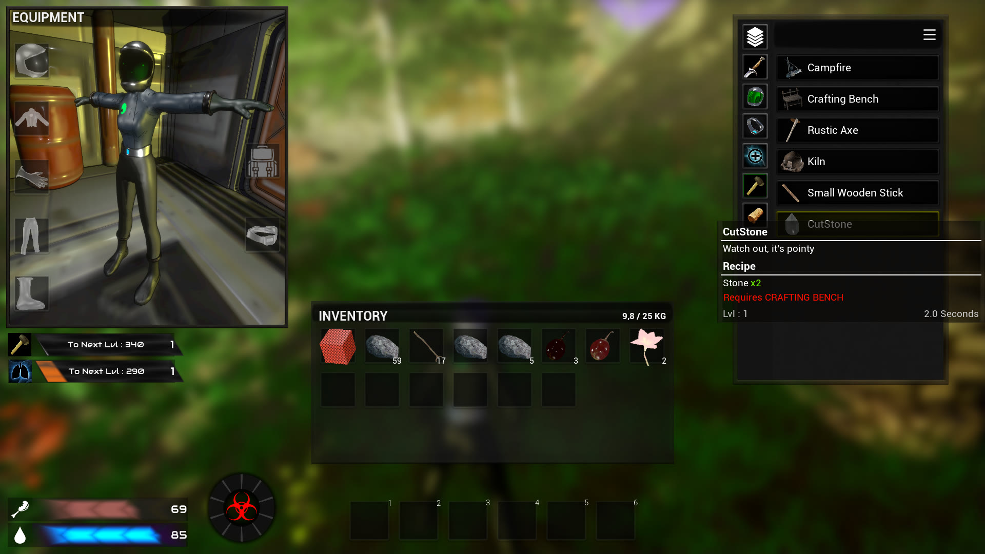
Stranded in Outer Space user interface tries to give you necessary data and nothing more. As an example, the “Health” and Stamina bars hide when they are full. Following the same logic, Builder and endurance experience bar are displayed when inventory is opened, but crafting levels are displayed when you let the cursor on a skill category button, saving space.
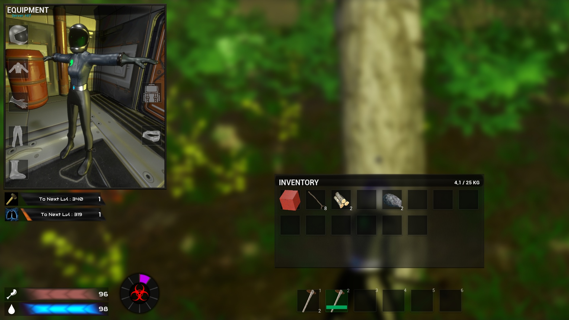
On top of them is the Equipment frame (Regular “Drag-n’-Drop”) and two experience bars : Builder and Physical training.
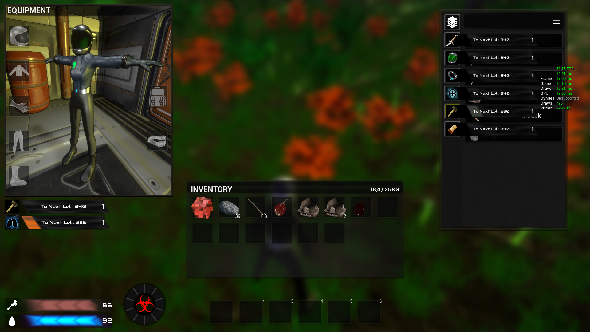
These categories progression display is triggered by the cursor staying on the button.
Formula : Chances = (Skill/ (Difficulty * Server Difficulty)) x 100 here : (1 / (1*1.2) )x 100 = 83%
A “Great success” is also possible, giving a bonus…
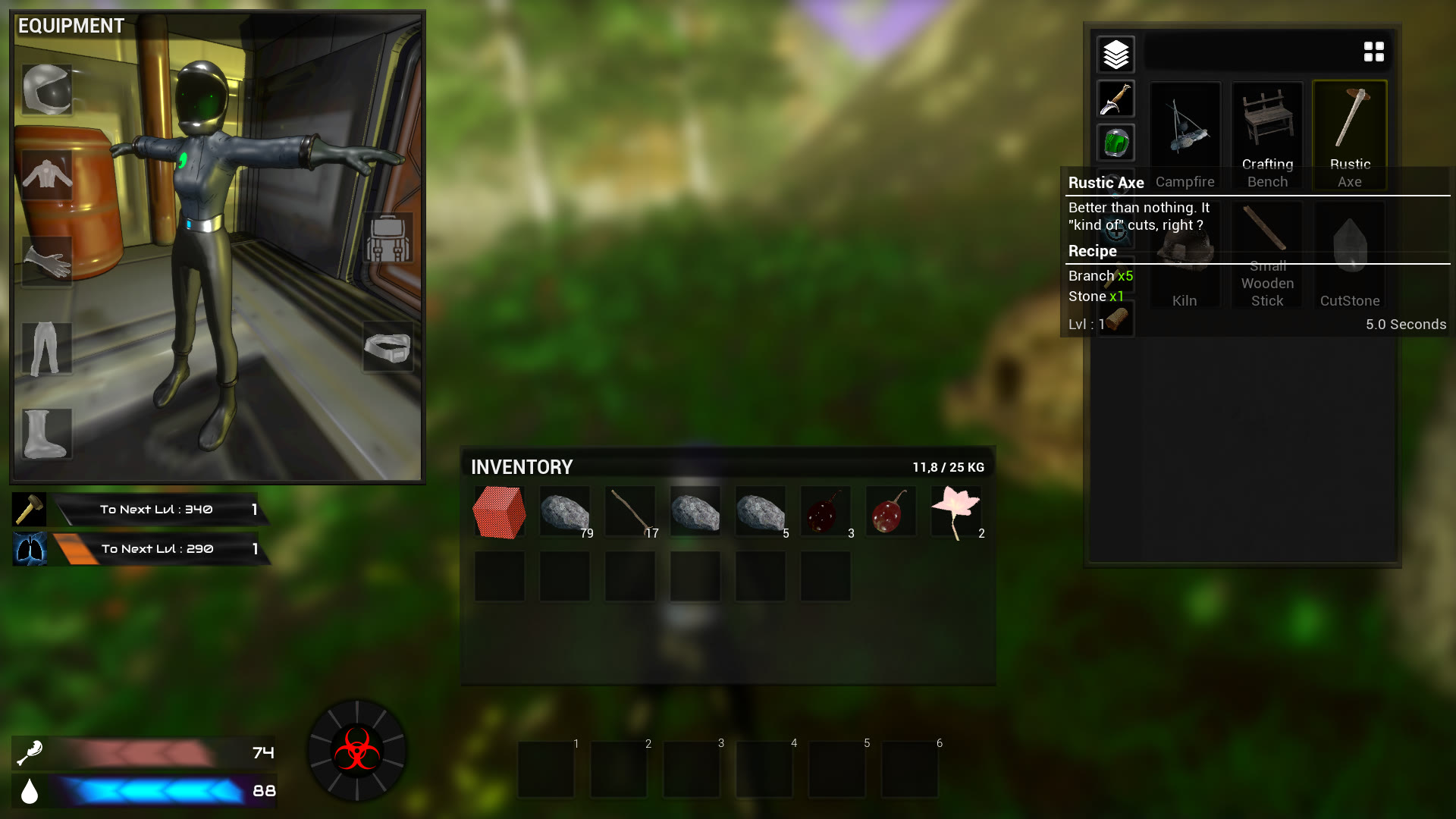
One last important element : The inventory !
It’s split in two parts : The main inventory, that grows according to the room in your equipment, and the quick access bar.
Stacks can be split by right-clicking → Split ( a quantity selector will appear )
The quick access bar can only contain handheld objects and allows quick switch between tools / weapons using the mouse wheel or controller button .